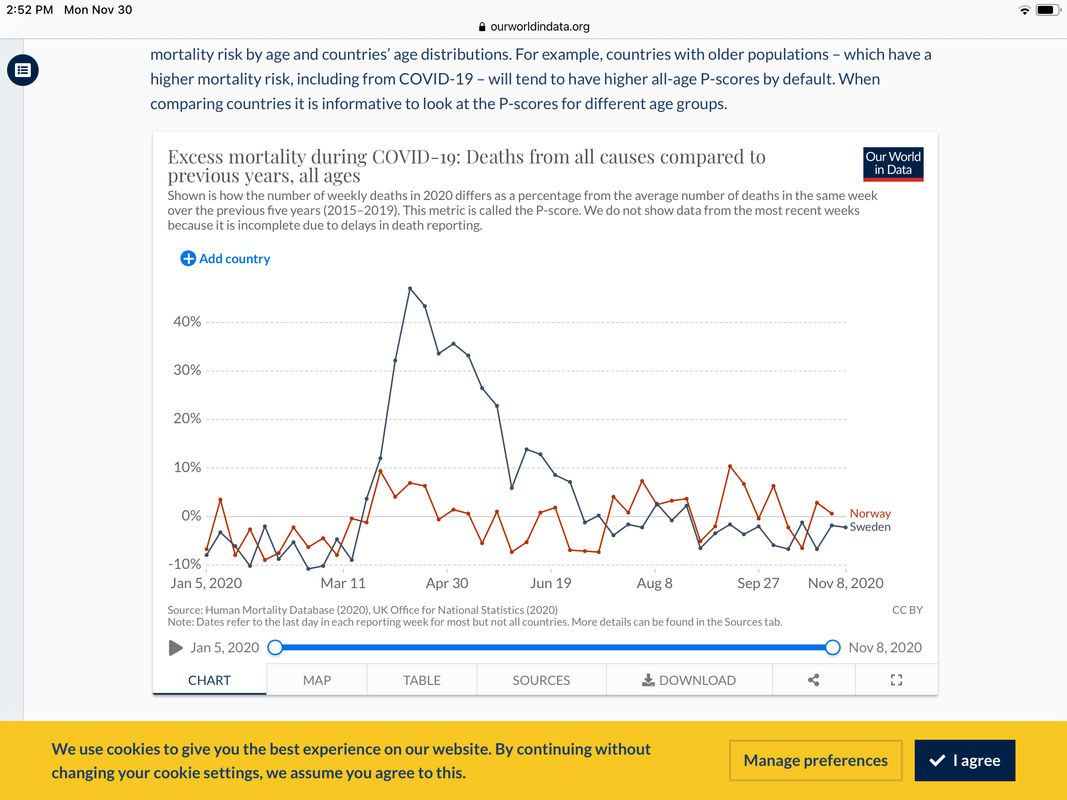
Your chart simply shows excess mortality spiking during the heart of the pandemic and dipping into negative territory much of the rest of the year.
No, my chart shows that for Sweden vs. Norway compared to the last 5 years *both* are in negative territory for most of the year (including the months before the pandemic) with a small short spike in Norway and a corresponding massive extended spike in Sweden during the heart of the pandemic.
Sweden was negative before the spike, but since then, theyve been just about at the baseline or positive with a possible dip back to negative for the last month or two (in which we dont have complete data yet).
ETA: lo and behold, the dip did not remain there.